
POWER PLEASE
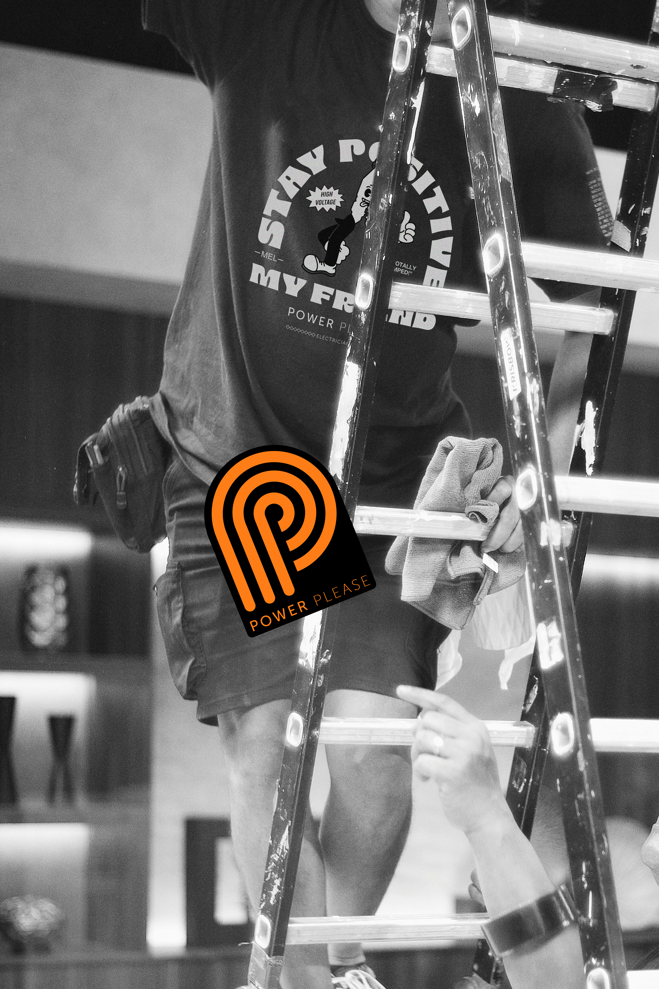
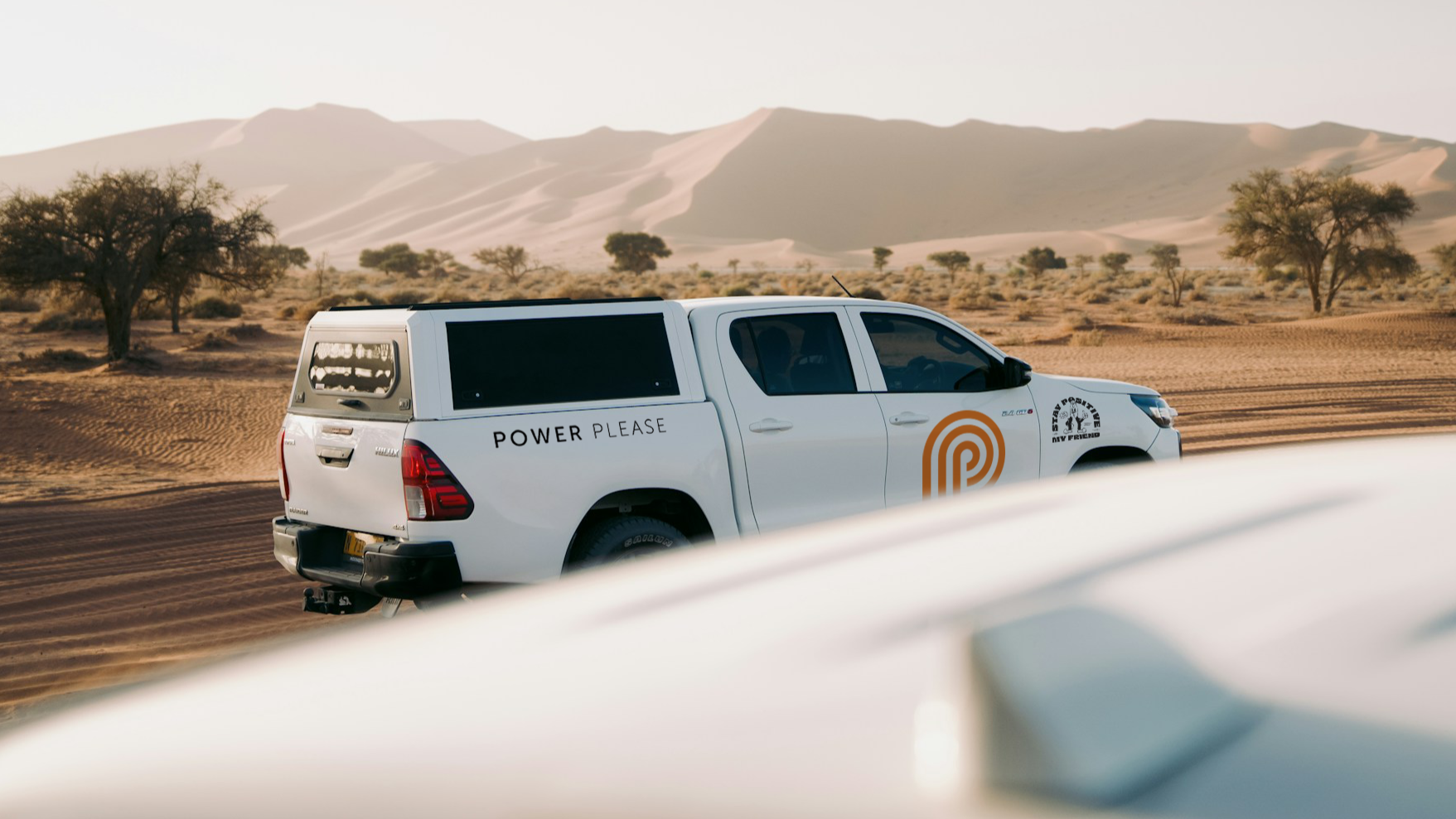
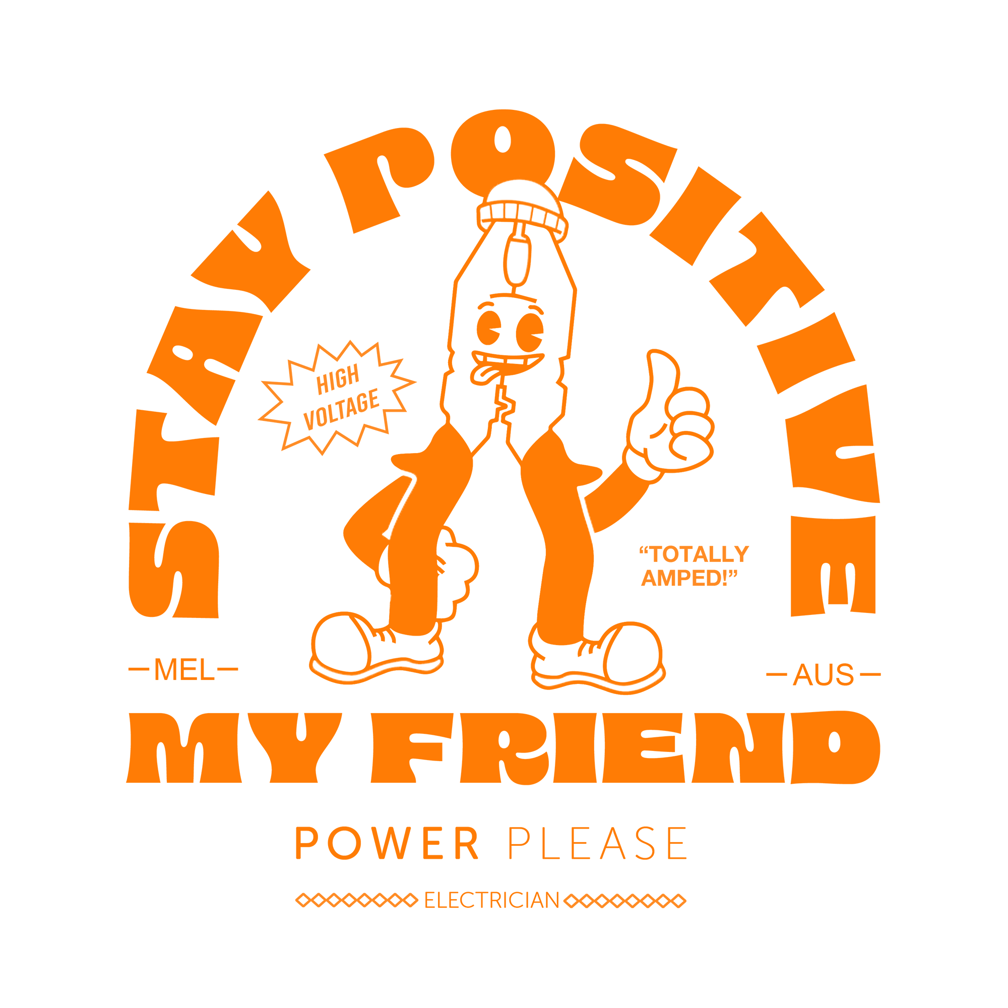
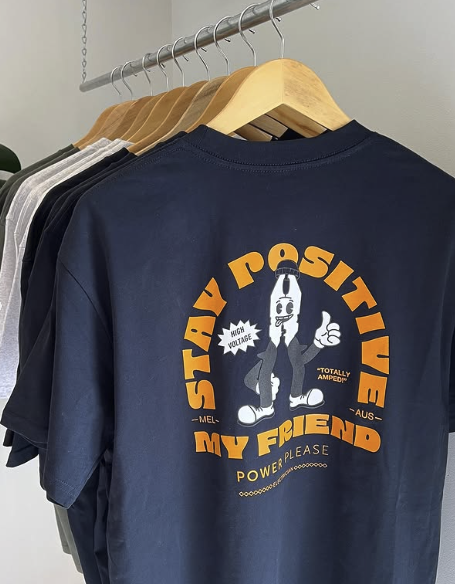
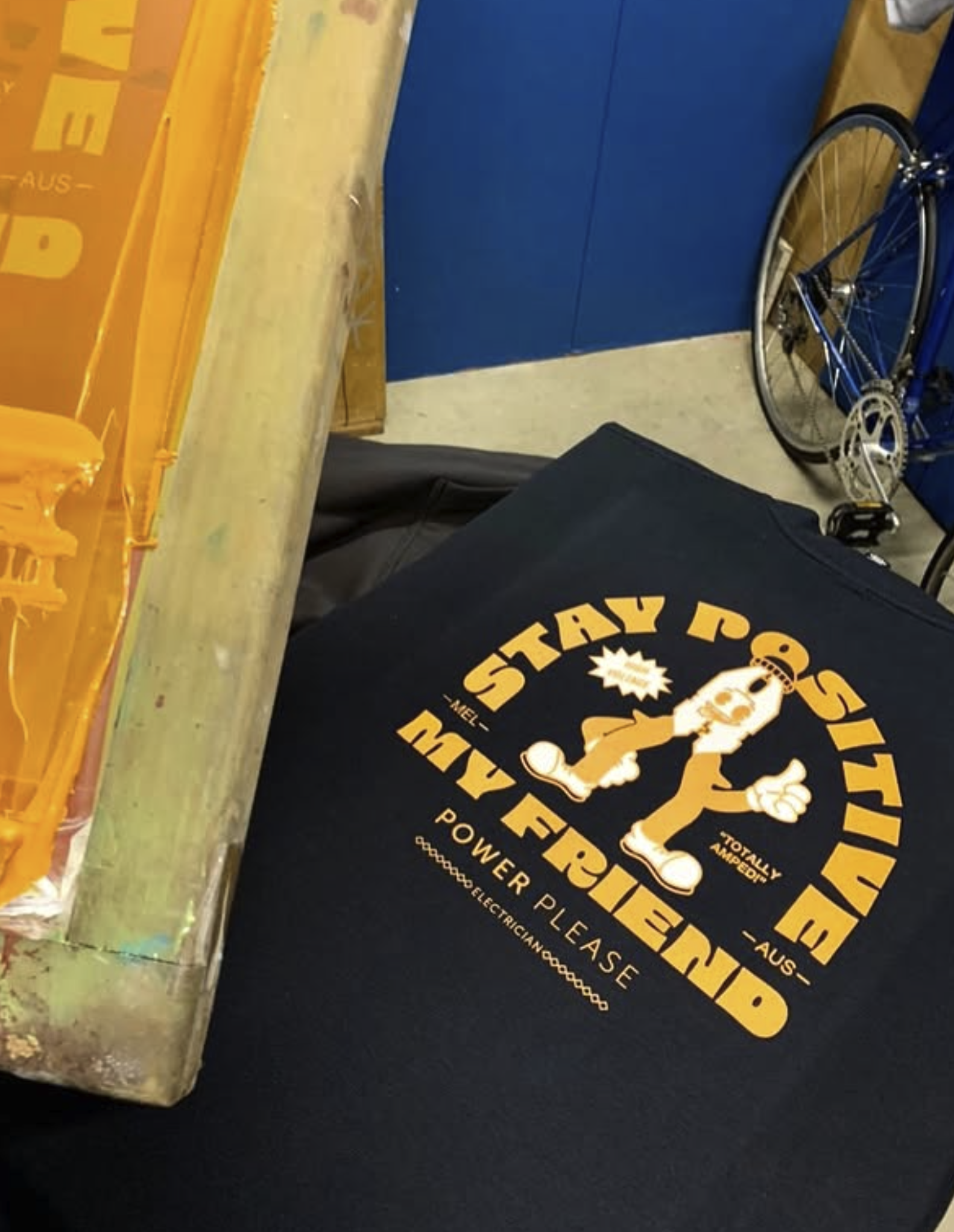
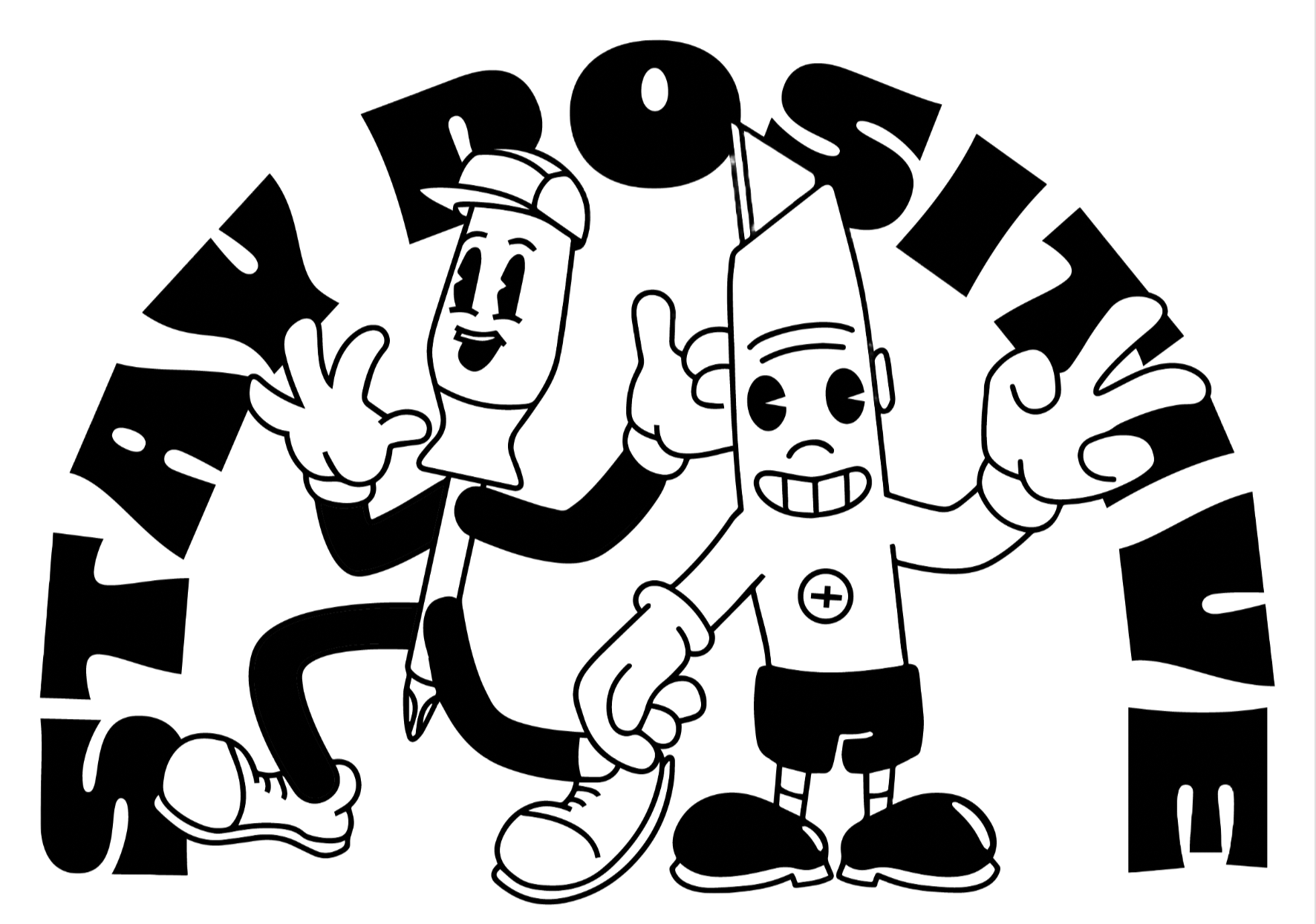
Most trade brands look the same. Power Please required more than just a logo. The client want a personality. The identity combines a clean, recognisable symbol with a playful illustration inspired by vintage cartoons. Custom illustrations extended the identity beyond the logo, giving the brand a unique visual language that could evolve across campaigns, merchandise and everyday brand touchpoints. Creating a brand that feels approachable, memorable and full of character while standing out in a traditionally conservative construction or trades and services industry.